Platform 3.0
Led the end-to-end redesign of a B2B print and marketing platform — information architecture overhaul, five ordering paths unified, and the company's first design system.
TL;DR
- Led an end-to-end platform redesign as the UX designer, from the initial analysis through the design system and the developer training that followed.
- Treated the information architecture overhaul as the main project rather than a preliminary, because a redesign layered over a bad structure only makes the wrong thing prettier.
- Consolidated five separate ordering paths into one experience and built the company’s first design system, scoped in six parts before anything got built.
- Improved release times by 35% across three teams on different continents, and assessed the organization against the Nielsen Norman UX maturity model rather than guessing at where it stood.
- Faster releases
- 35%
- Ordering paths
- 5 to 1
- System parts
- 6
Overview
Platform 3.0 was the end-to-end redesign of a B2B print and marketing platform serving real estate brokerages. I led it as User Experience Designer from the initial analysis through the design system and the developer training that followed.
The pitch I took to leadership had five parts: a visual redesign, an improved search, a dashboard with real-time data, a single unified ordering process, and standards for UI/UX and frontend development. The last two are the ones that mattered most, and they are the ones nobody asks for.
The problem
The platform had accumulated. Ordering did not happen in one place; it happened across five separate paths depending on which product a customer wanted and which system they entered through. Search was weak enough that customers could not reliably find products they knew existed. Reports and approvals were awkward. Address lists could not be edited inline.
Underneath the feature complaints was a structural one. Nobody could say where everything on the site was, or how you got to it.
Approach
The information architecture came before the interface
I treated the IA overhaul as the big project rather than a preliminary, and started by mapping what actually existed against a set of questions I kept returning to: What do we need and what don’t we need? What is in the right place and what is in the wrong place? How do I find this or that, and is that a good experience, and is there a better way?
The goal was to reorganize content so it made sense to customers and could be found without much thought. Everything visual downstream depended on getting that answer right first, because a redesign layered over a bad structure just makes the wrong thing prettier.
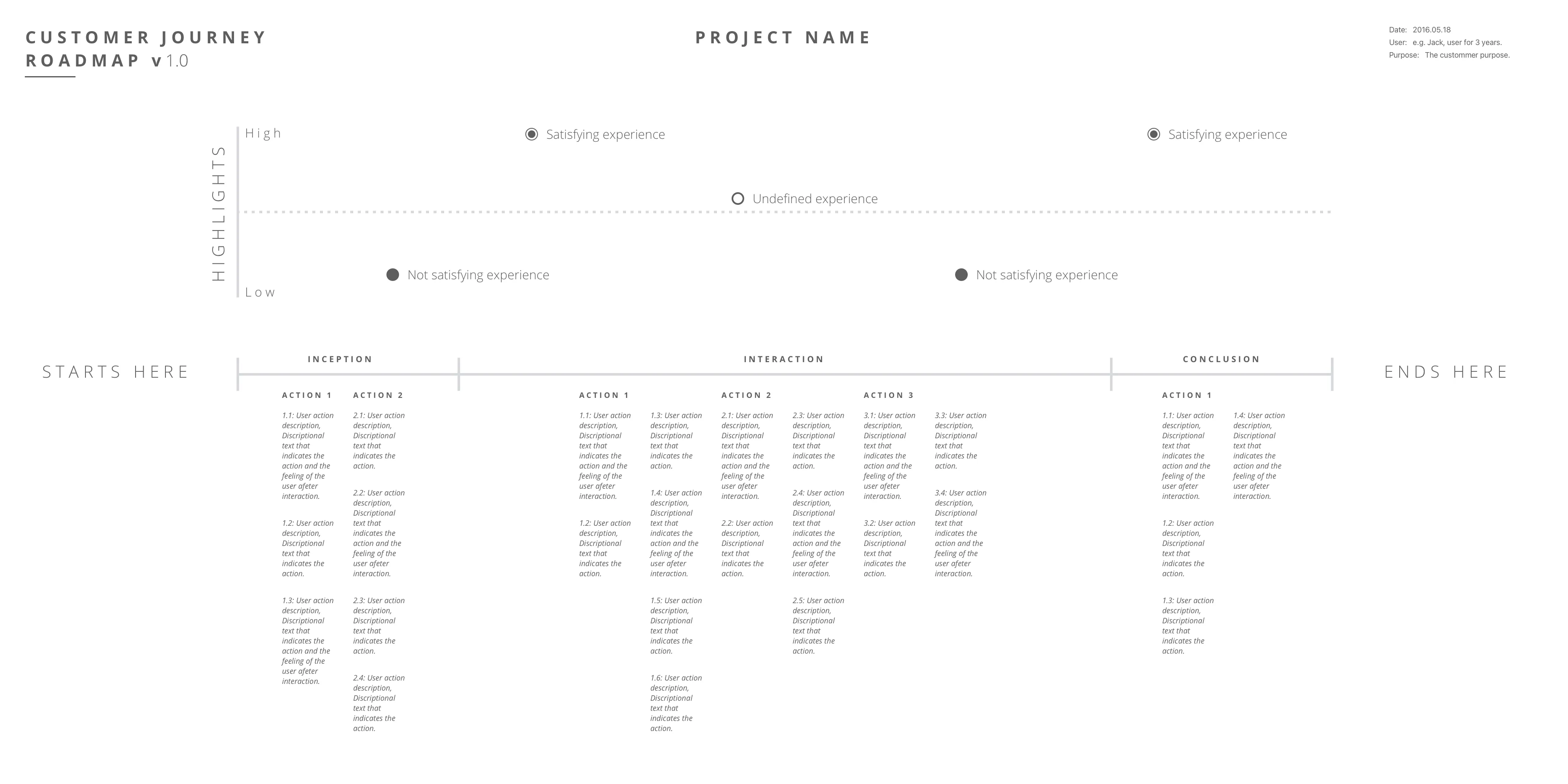
Five ordering paths, one experience
The single largest piece of the redesign was consolidating five distinct ordering systems into one consistent flow. Customers experienced them as one company, so the fact that different products routed through different internal systems was our problem to absorb, not theirs to learn.
The search work sat alongside it: real keyword search, suggestions while typing, and a browsable category menu for customers who did not yet know the product vocabulary well enough to search for it.
The company’s first design system
I wrote the definition down before building anything, because “design system” meant something different to everyone in the room. What I scoped had six parts:
- Pattern library — icons and UI elements
- Style guide — color, typography, and layout standards
- Documentation — how to actually use and implement the two above
- Coding standards — language and writing-style conventions, best practices
- Framework and library standards — how to build the frontend to be modular, mobile-first, and future-ready
- Design standards — the design tool decision, and a shared library so every designer was pulling current assets
That last item is the one that made it a system rather than a document. A shared Sketch library meant an updated component reached every designer’s file instead of living in whichever project happened to be open when it changed.
I had written out the requirements a system would have to meet before I picked any of it: one constantly-updated place for reusable components, mandatory notification when an asset changed, assets every designer could actually use in their own projects, downstream design files told when a component they used had moved, and any team member able to update the system without a versioning fight. Those requirements are the same ones I would write today.
Testing the prototype honestly
I built the order flow as a clickable InVision prototype and wrote a protocol designed to keep me from contaminating the result.
Each participant went through two passes. The first was initial reaction with zero involvement or guidance from me. The second allowed assistance, but only when asked for, and the assistance had to be unbiased. Feedback came through a written questionnaire rather than conversation, specifically to avoid the interference that a hovering designer introduces.
The three questions underneath the whole research effort were plain: What are they doing today? Would they use this? Can they use this? Interview research answers the first, design artifacts and reactions answer the second, and only a usability test on something clickable answers the third.
I also pulled internal feedback from the development and customer service teams, since customer service hears the actual complaints before anyone else does.
Teaching the developers instead of policing them
Standards do not survive on a wiki. I built a design training program to gauge each developer’s design education and eye for design, and paired it with a curated reading list covering interaction design, visual consistency principles, motion, and atomic design.
This is where the cross-training in my resume comes from. The engineers were not resistant; nobody had ever explained the reasoning to them. Teaching the why turned standards enforcement from my job into a shared default.
Measuring the organization, not just the product
Partway through I assessed the company against the Nielsen Norman Group’s eight-stage UX maturity model and put us between stages 4 and 5. We met the defining criterion for that level, a dedicated UX budget with UX planned as a quality process. We failed several others, and I named them rather than rounding up: no budget for recruiting test participants, usability testing happening late in development after the interface was already partially built, no usability lab, and no real choice of research methods.
Writing “usability testing happens too late here, which is contrary to best practice” about your own team is uncomfortable. It is also the only way the budget conversation ever gets grounded in something other than opinion.
Outcomes
- Release times improved by 35%, achieved by streamlining communication and reporting across three teams on different continents.
- The company’s first design system, along with the reusable interaction patterns underneath it and the developer adoption program around it.
- Five ordering paths consolidated into a single consistent experience.
- Analytics instrumented through Google Tag Manager, so the redesign’s effects could be observed rather than assumed.
Reflection
This project is where I learned that the interesting problems are structural. The visual redesign was the part everyone could see and the part I spent the least time thinking about. The information architecture, the ordering consolidation, and the design system were the actual work, and none of them photograph well.
It is also where the pattern I have repeated at every job since first showed up. Write the standard down, make the tooling enforce it, then teach the reasoning so people stop needing the enforcement. I did it here with a reading list and a training program. I did it later with stylelint configuration and pre-commit hooks. The layer that changes is the automation; the shape of the problem does not.